Website
Branding
Web App
Zerotoonelab Designathon 2025
The ZeroToOne Lab Designathon 2025 website was created to promote our annual design challenge and serve as a single destination for participants to explore the event, understand the process, register, and stay informed. I designed and developed the complete website in Framer, focusing on storytelling, interaction, and responsive performance.
Role
Framer website Developer
Timeline
2025 | 4 weeks
Client
Zerotoone Lab
Tools



Problem Statement
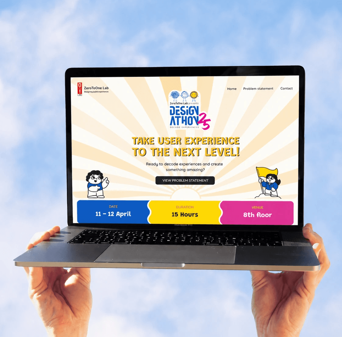
Unlike product dashboards where users return frequently, event websites have only a few seconds to capture attention.
The experience needed to answer questions immediately:
What is this event?
Why should I participate?
When is it happening?
How do I register?
What do I gain from joining?
Every section was designed to progressively answer these questions while maintaining visual momentum throughout the page.
0%
0%
of visitors can’t find the registration deadline in their first 30 seconds
0
0
sections a visitor scrolls past before the event date & venue appear
0%
0%
arrive on mobile, where the long, animated page is hardest to scan
0%
0%
leave the site without finding the answer they came for
Defining Problem Statement
A designathon isn't just another company event—it represents creativity, innovation, and community. The website needed to generate excitement while making it effortless for visitors to understand what the event was about and how to participate. The challenge was to balance vibrant visuals with clear communication without overwhelming users with information.
Research
Rather than jumping into visuals, I started by asking who actually opens the Designathon page and what they're trying to find in their first thirty seconds.
I mapped four very different visitors, from a curious student to a team lead assembling four people, and traced the exact questions each one arrives with.
Visitors weren't looking for a beautiful page they were hunting for five facts: what, when, where, who can join, and how to register.
Opportunity mapping
Once I knew the questions visitors arrive with, I mapped every block of the page against how urgently it's needed and how much it drives a registration.
Instead of adding more sections, I re-ordered and sharpened the ones that answer the five core questions first and let personality carry the rest.
Every block was prioritised on two criteria:
• Information Priority — how urgently a visitor needs it to decide whether to join.
• Decision Impact — how strongly it pushes a ready visitor toward registering.
Rather than a longer page, Designathon 2025 front-loads the essentials what, when, where, who and how then uses colour, motion and illustration to keep momentum toward the CTA.
The Final Experience

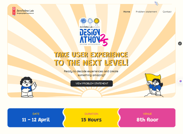
Hero + CTA

Prizes

Sneak Peek '24

Team Formation