Mobile App
Design System
Food
LAMI - Recipe App
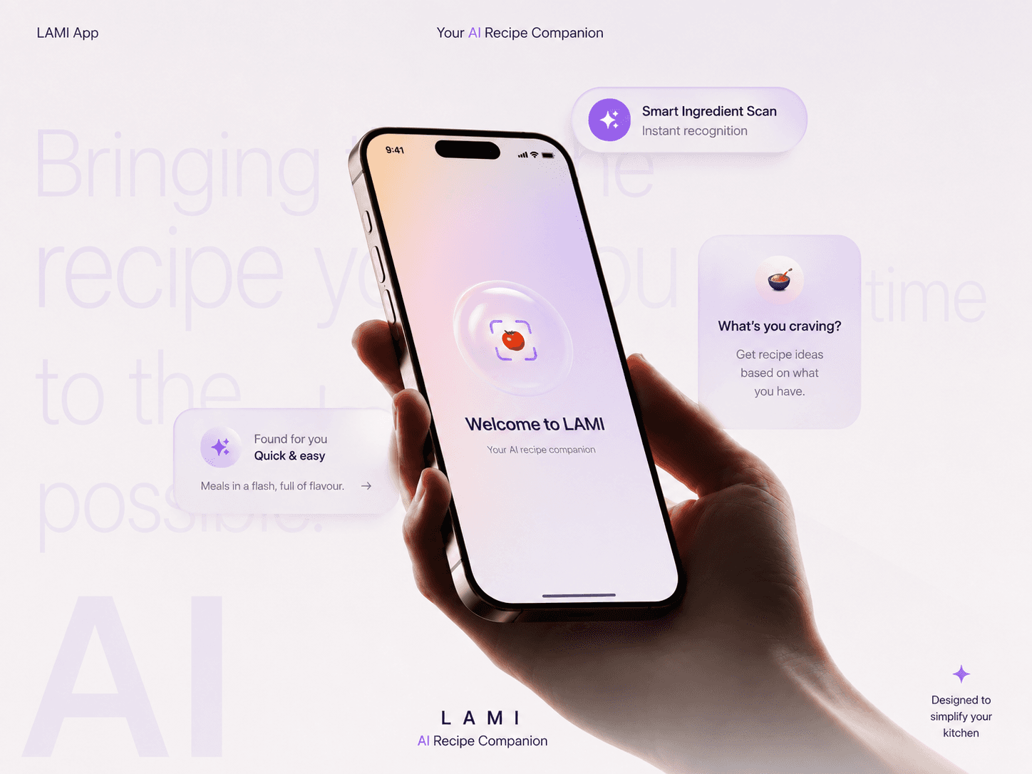
Most people don't lack recipes they lack a starting point. Standing in front of an open fridge with random ingredients is where most home cooking gives up before it begins. I designed LAMI to remove that starting-point problem entirely: point your camera at what you have, and get an instant, cookable recipe no searching, no typing, no decision fatigue.
Role
End-to-End Product Designer
Timeline
2025 | 4 weeks
Project
Experiment
Tools



Problem Statement

"What do I even make with this?"
Every existing recipe app assumes you already know what you're looking for a dish name, a cuisine, a diet filter. But the real moment of friction happens earlier than that: standing at the counter with a handful of ingredients and zero inspiration.
Recipe apps are search-first, not fridge-first you have to know what to type before they're useful.
Ingredient-based tools that do exist (filters, tags, checklists) still demand manual data entry before they return anything.
The gap between "I have food" and "I know what to cook" is where most people give up and order delivery instead.
Questions
What's actually in front of me right now?
What can I realistically make with just this?
How long will it take, and is it worth the effort tonight?
Do I need to buy anything, or can I start cooking immediately?
How do I know if I even liked what I made, so next time is better?
Activities
Competitive Teardown (Yummly, SideChef, Samsung Food, SuperCook, Tasty)
Ingredient-to-Recipe Flow Mapping
User Interviews
Journey Mapping
Information Architecture
Interaction & Motion Concepting
Design System
High Fidelity Prototyping
0%
0%
users said they'd abandoned a recipe search mid-way because it felt like too much effort
0
0
taps from "I have ingredients" to "here's a recipe"
0
0
camera-based entry point replacing search, filters, and typing
0
0
manual ingredient logging required to get a result
Defining Problem Statement
Home cooks weren't asking for a bigger recipe library. They wanted the app to meet them at the fridge, not at a search bar. Instead of designing another discovery feed, I designed a capture-first experience one where showing the app your ingredients is the search.
Research
Rather than starting with screens, I mapped the actual decision path people go through between feeling hungry and having food in front of them from opening the fridge, to deciding what's realistic, to actually cooking it. This surfaced where indecision, friction, and app-abandonment happen.

Home cooks don't need more recipes. They need immediate confidence that what's already in front of them is enough to make something good, right now.
Opportunity mapping
After mapping the full decision journey, I identified where digital interaction could remove the most effort not by digitizing every possible recipe feature, but by focusing on the single moment that stalls people: turning "I have ingredients" into "I have a plan."
Every feature was prioritized against two criteria:
Decision Speed - How quickly does this get someone from craving to a cookable answer?
Effort Reduction - How much manual work (typing, scrolling, filtering) does this remove?
Rather than building a feature-heavy recipe platform, LAMI focuses on removing friction from the one interaction that happens every single day: deciding what to cook.
Information architecture
LAMI isn't a recipe library with a scan feature bolted on. It's built around a single capture-first loop, with a lightweight browse layer sitting on top for people who want to explore rather than scan.
The Scan Journey handles the "I have ingredients, tell me what to make" moment. The Browse Journey (Popular Categories, Trending Now) serves the "I want inspiration" moment. Both live on one Home screen so neither path feels like a detour.

Design Principles
Designing for a kitchen environment meant prioritizing speed and glanceability over feature density. The primary users aren't recipe experts they're hungry people with wet or busy hands, looking at their phone for ten seconds at a time. Every decision aimed to minimize effort while maximizing confidence.




Competitive landscape
Before defining LAMI's feature set, I audited the ingredient-to-recipe category to understand how existing players actually solve or fail to solve the "what can I make with this?" moment. The pattern was consistent: most apps treat ingredients as a search filter layered onto a large recipe library, not as the primary way in.

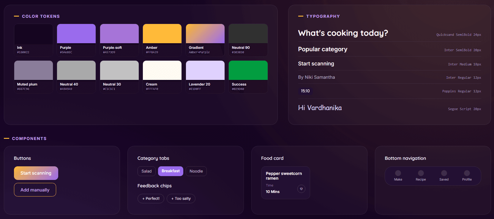
Design system
With a capture flow, a browse layer, and a growing card-based content system, visual consistency mattered from day one. A shared design system ensures every interaction from the scan hero to feedback chips to food cards feels like part of the same product, regardless of entry point.
The Final Experience

Home screen

Scanned Ingredients
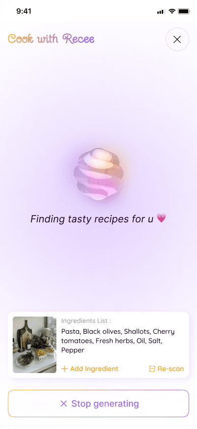
Recee Chat
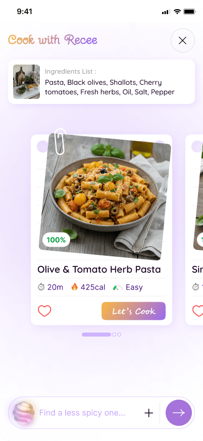
AI Suggested Recipes

Recipe Steps

Recipe Completion
Impact Overview

Removed the search step entirely
Replaced typing and filtering with a single camera capture, cutting the path from craving to recipe down to three taps.
Reduced decision fatigue
By surfacing one confident recipe result instead of an infinite scroll of options, the flow avoids the "too many choices, no motivation" drop-off identified in research.
Closed the feedback loop
Post-cook chips give the product (and future personalization) a lightweight way to learn from real outcomes, not just recipe views.
Built for extension
The Home screen's Browse layer (Popular, Trending) and the reserved Recipe/Saved/Profile nav destinations mean the capture-first core can grow into a full recipe platform without a redesign.